Scene-Stealers reader Ryan Klima had the nerve to do what any true movie fan must do one day in their life to prove their mettle. He submitted a Top 10 list to Scene-Stealers. If you’d like to take a crack at one of your own, email me at eric@scene-stealers.com. Here’s Ryan:
Today in the age of TV and the internet, movie producers put all their marketing effort into the commercials, which are always annoying and played way too often. I find it sad that the original medium of showcasing upcoming movies is going downhill. Of course, I’m talking about movie posters. Conveying the emotions and feeling of a two-hour film on a 2D piece of paper can be extremely difficult. In fact, movie posters nowadays are mostly cut-and-paste jobs featuring the star of the movie smiling awkwardly into the camera. (Or screaming, depending the genre.) So I’ve compiled a list of the Top 10 Iconic Movie Posters of all-time—posters that only need one passing glance to make you say “I’m going to watch that.”
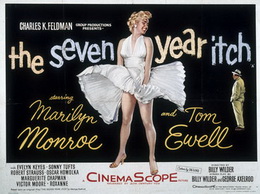 10. The Seven-Year Itch (1955)
Who could forget the image of the wind tunnel blowing up Marilyn Monroe’s skirt? I certainly can’t. This poster was going to be higher ranked, but it really doesn’t tell what the hell the movie is actually about. Is it 90 minutes of Marilyn under a wind tunnel? If only it was. Then again, without this poster, the movie probably would have been ignored. Who would want to watch a movie about a seven-year itch? In the age of Neosporin, that isn’t even possible. And what’s that guy in the background wearing, a beige jumpsuit?
 9. 2001: A Space Odyssey (1968)
You got to admire the balls of Stanley Kubrick by putting a fetus on the poster: You’d think that would turn people away. But no, with the tagline he promised us the ultimate trip, and believe me—he delivered. I’ll bet Cheech and Chong were mad though; “The Ultimate Trip” would have been the perfect tagline to one their movies. Back to “2001”: Of all the astounding visuals in the film, I believe the fetus was the best choice; maybe the trip wasn’t the journey of the astronauts, but the trip of Mankind itself. Wow that’s deep.
Maybe it’s just me, but add some hair to that fetus and he’d look exactly like a young Frankie Muniz.
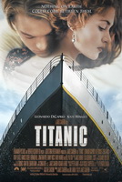 8. Titanic (1997)
This is definitely one of the more popular posters of all time, which automatically warrants its iconic status. But I always hate posters with floating heads at the top of the page. I don’t know how they did it—but they made Leonardo DiCaprio and Kate Winslet’s heads bigger than the Titanic itself.
It is also probably the only iconic poster to feature an actor sniffing a fellow castmate.
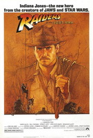 7. Raiders of the Lost Ark (1981)
Sure, Steven Spielberg is pretty good at this directing thing—but his real talent is in poster making. Three of Spielberg’s works are in this Top 10 list. Whether it’s Indiana Jones or Cheech and Chong, you just can’t go wrong with a hand-drawn poster. By hand-drawing a poster, you can create a mash of colors you just can’t duplicate in real life. The first three “Star Wars” films (also written by George Lucas, like Indy) also use this effect, but they’re so filled with characters you think you’re looking at a “Where’s Waldo?” puzzle.
The only problem is that Indy looks like he has a mustache. Heroes have a clean face.
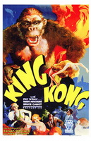 6. King Kong (1933)
Movie posters rarely use a lot of color anymore. This masterpiece of a one-sheet looks as though a paint truck exploded on the canvas. I look at this and I think every poster should be hand-drawn or painted. I mean, wow! I want this poster as my wallpaper and I don’t mean on my computer. I want this to be the wallpaper for my entire house. And look—Kong is on fire and it’s not even bothering him.
Now that’s toughness.
 5. American Beauty (1999)
Sometimes the simplest poster can be the best. I bet the guys who were supposed to make this poster (for the Oscar-winning Sam Mendes movie) totally forgot about it until the last second and just threw something together. It’s okay though, this poster is perfect. Even the tagline: “Look closer” is so simple, even though I have no idea what that means.
And for you perverts who are aroused by this poster, the joke’s on you, that’s Kevin Spacey’s stomach.
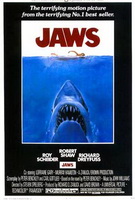 4. Jaws (1975)
This is easily the most recognizable poster of all-time; even though this scene is nowhere in the movie. If there was a museum for movie posters, this one would be surrounded by a velvet rope and bodyguards to make sure you don’t touch it. Out of all the huge shark movies out there, this one is the best.
Of course, it’s the only one directed by Steven Spielberg and it single-handedly launched the summer season as blockbuster central.
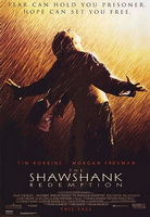 3. The Shawshank Redemption (1994)
This is the most iconic image plus it has the most iconic tagline of all time; so why didn’t this one win the top spot on my list? Simple. I don’t like the font. Nah, I’m just kidding. There’s really no order here. I really love this poster. Most kids have pictures of athletes or singers on their wall—I have Tim Robbins.
I tell you, whenever there’s a rainstorm outside; I always strike this iconic pose, much to the mockery of my sister.
 2. Pulp Fiction (1994)
Perfecto. The poster for Quentin Tarantino’s cultural watershed captures the essence of film noir with a butterfly net full of awesomeness. The 10-cent stamp is a great touch. Oh, and Uma Thurman is pretty nice too. I saw this poster at a garage sale, so naturally I took out my Badass Motherfucker-imitation wallet to purchase it. To my horror, some schmuck scribbled out the 10-cent stamp, mistakenly thinking that it was not part of the poster.
I was so mad I had to recite Ezekiel 25:17 to calm me down.
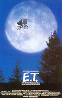 1. E.T. the Extra-Terrestrial (1982)
We have a winner folks! This poster is so iconic that Spielberg made it the logo for his Amblin Entertainment. What’s even more amazing is that I read on Wikipedia that this poster is real—some kid actually jumped his bike and they took the picture.
Thanks for reading everybody!
I made a poster for this Top 10 list…


{ 16 comments }
Bravo… Bravo. I really enjoyed the commentary.
Star Wars.
I know its under the radar flick but I’ve if I ever see movie posters up at someone’s house Boondock Saints is always included.
Great list. I know you have to go with the original in most cases but i am a huge fan of the 1976 King Kong poster. It shows the giant ape streched out across the Twin Towers, holding Dwan in one hand and crushing a jet in the other. He is being circled by fighter jets (later replaced by helicopters). In the background you can see the Empire State Building, his original stomping grounds. The tag line read- The most exciting original motion picture event of all time. The bottom read King Kong for Christmas. Just Awsome, my favorite movie poster from my childhood.
A Clockwork Orange
I would add Starwars and 40 Year Old Virgin
kubrick movies always had good posters, and I think Barry Lyndon is the best of them
I have to go with Raiders of the Lost Ark as my favorite on this list. It gets the point of the movie across without the saying too much. Indy looks ready to take on any adventure which the old timey, treasure map quality enhances. On another note, although I have never been aroused by the American Beauty poster, I am disturbed to know that Kevin Spacey’s abdomen looks like that of a young girl. Brilliant twist of an image, though.
I think that bit about Spacey was a joke.
ATTACK OF THE 50 FOOT WOMAN – the 1958 original – is a universally known iconic poster (sure she’s about 200 feet but come on!)
;0
great list Eric. most of these you listed are definitely in my favorites. these are some of my favorite movie posters:
• Boondock Saints
• Gladiator
• Braveheart
• Swingers
• Scarface
• Wolverine
• Walk the Line
• Dark Night (the Why so Serious? one with the Joker)
• Forest Gump
• Secretary
• Office Space
• 40 Year Old Virgin (even though it’s just Steve Carell)
• Eternal Sunshine of the Spotless Mind
• Fight Club
Ok, that’s enough.
Jake-
Love your list too. Some of the posters (Wolverine, Scarface) are better than the movies!
I can’t take credit, though. The list above was created by SS reader Ryan Klima. (See the opening paragraph!)
Scarface?
About the JAWS poster, isn’t the artwork on that poster based on Susan Backlinie’s (aka Christine Watkins) death scene in the beginning of the movie? I googled it and found a few sources that point to the girl skinny dipping in the lake and getting herself killed. Just saying.
Great poster though.
This list included some of the very WORST posters I have ever seen! Where’s the Drew Struzan and John Alvin gems? And to top it all you choose a photograph as the number one!! PS: Titanic sucks.
I don’t think you have any idea about posters or design lol…but somehow you did manage to put a few good ones in here.
Comments on this entry are closed.